This project was about creating a brand identity.
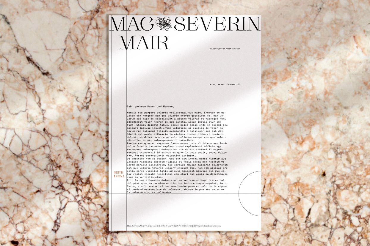
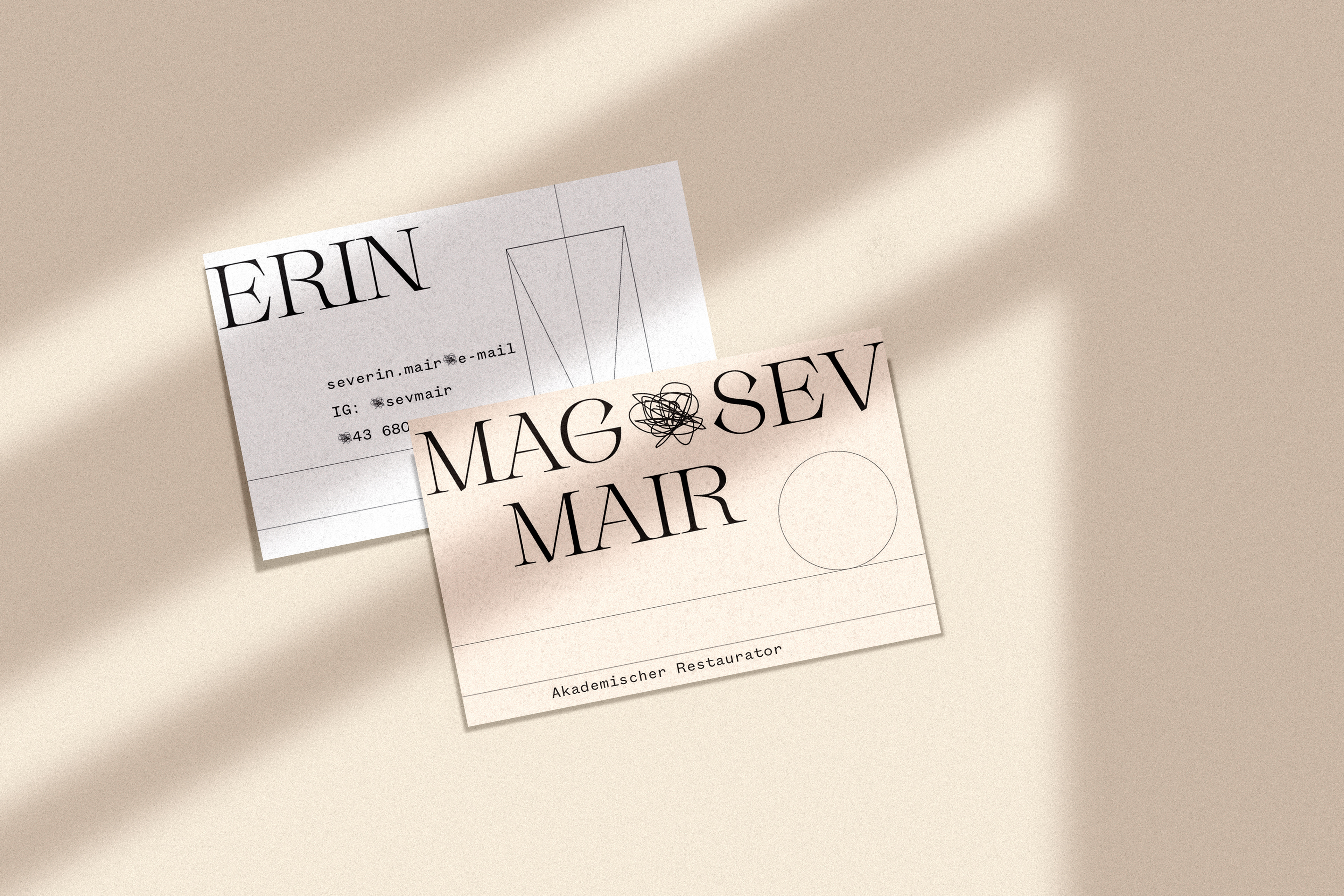
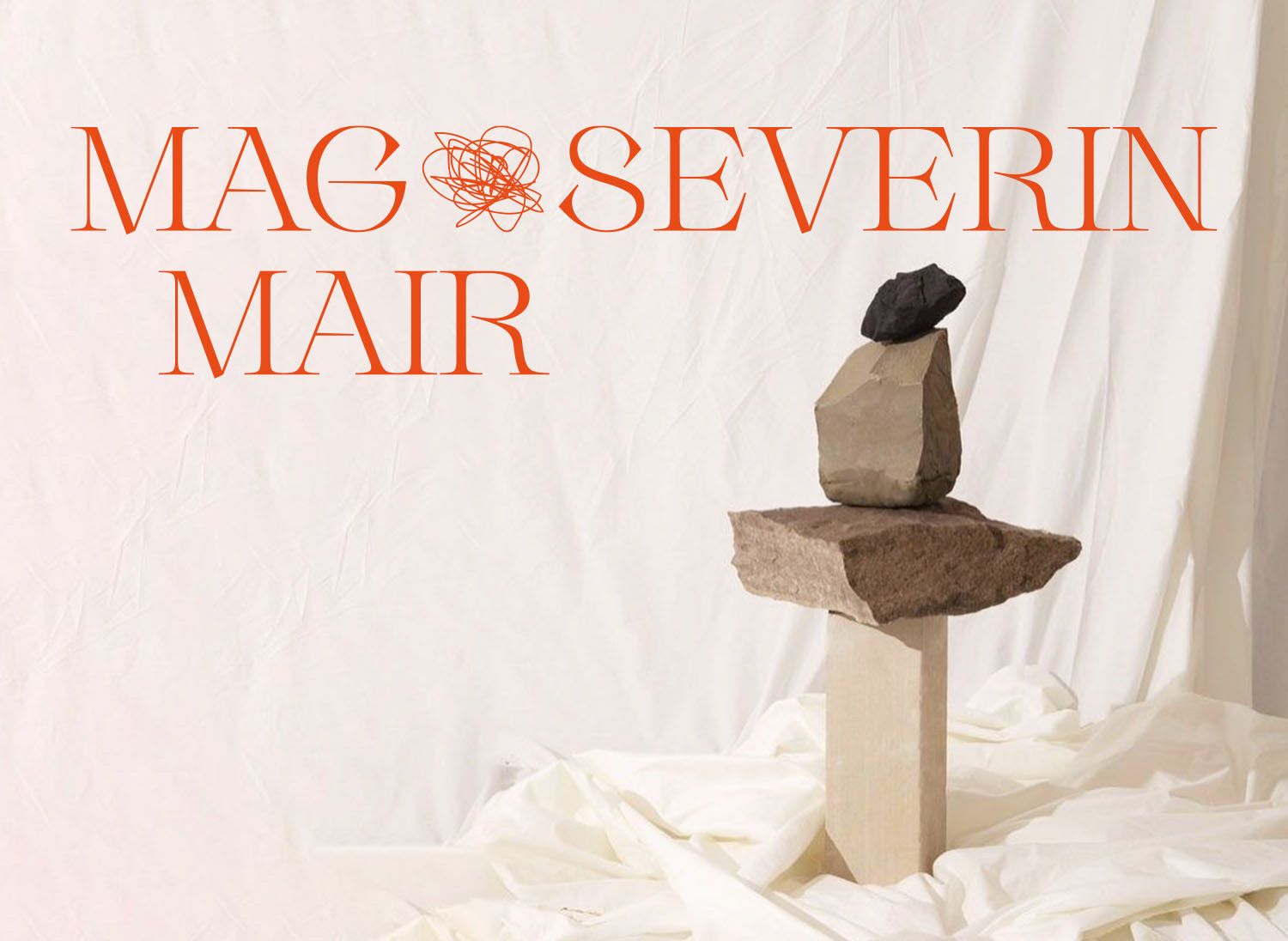
The clients wish was to show the geometric-exact component of his work as a restorer on the one hand, and on the other hand the hand-drawn aspect of his work is important to him. Severin Mair still draws many of his plans by hand, which is special in times of AutoCAD. For the logo, I chose a typeface that conveys a kind of robust fragility – the typeface should be as delicate as the art that is chiselled into the stone sculptures and as robust as the stone itself. The doodle used as a dominant element in the design is meant to refer to the drawings by hand. The colours are based on the material the client works with.
2021, client: Severin Mair